blog
How to Improve Banner Blindness Through Better Design
Every day, people see hundreds of ads online. However, do you remember the last time an ad actually grabbed your attention, much less got you to click? The answer is essentially never for the majority of today’s internet users.
In fact, studies show that around 86% of people ignore banner ads online because their brains have learned to block them out.
This is called banner blindness. It means your ads are not doing their job. You might spend money on ads, but get very few clicks.
In fact, the average click-through rate for a display ad is only 0.1%
Today, smart design can help fix this problem.
This article will show you how to use smart banner ad design to wake people up and get them to notice your message again.
What Is Banner Blindness?
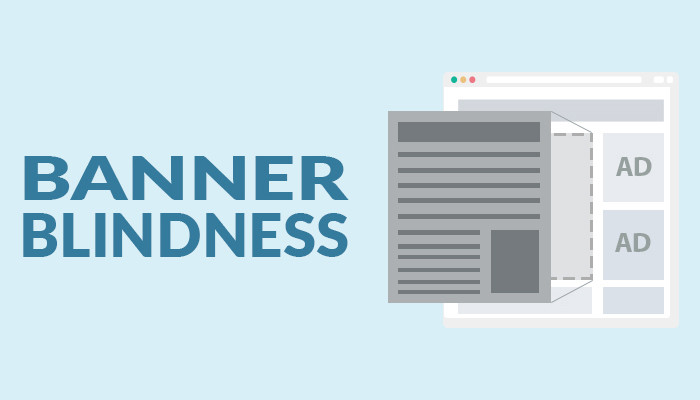
Source: LinkedIn
Banner blindness is when people do not notice or pay attention to online advertisements, either intentionally or unintentionally. This happens because our brains are wired to focus only on information that is of use to us at a given time. This is known as selective attention. This means that we focus on very few things and filter out everything else that is around us.
When a person browses their favorite website, they are exposed to multiple banners. However, if the banners are not eye-catching or if they do not contain what the person is looking for, the person closes the banner immediately.
Why People Ignore Banner Ads
The underlying cause of banner blindness is selective attention. People remain interested in what they want and ignore everything else that doesn’t help them. Because online pages are filled with tons of information, users only search for what is important to them and ignore the rest.
After using online services for a period of time, people quickly realize that most banner ads are not related to what they are searching for. Therefore, their brain automatically filters them out. There are several reasons for this reaction:
1. Ads Look Like the Same Old Designs
Most banner ads have a predictable format, rectangles, bright colors, and loud fonts. Because of this, users immediately recognize them as ads. Rather than standing out, they blend in and become simple to ignore.
Attempting to make these ads “pop” can sometimes make them look even more like ads, which only hastens the user’s reaction to ignore them.
2. Ads Don’t Speak to the Right Audience
Ads that are unrelated to their interests and needs are simply scrolled past. An advertisement is quickly disregarded if it doesn’t fit the reason for their visit or offer anything helpful. Effective banners have a connection to the content of the page or provide something valuable. If not, they are invisible.
3. Ads Are Placed in Predictable Spots
The advertisements appear in the same locations, like the top, the right, or the bottom. Users will quickly turn away because they are aware of the typical locations of advertisements. The availability bias is to blame for this.
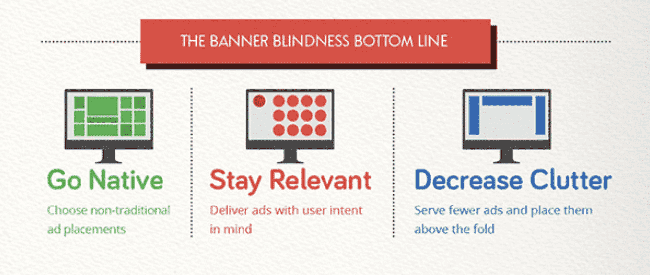
Simple Ways to Improve Noticeability
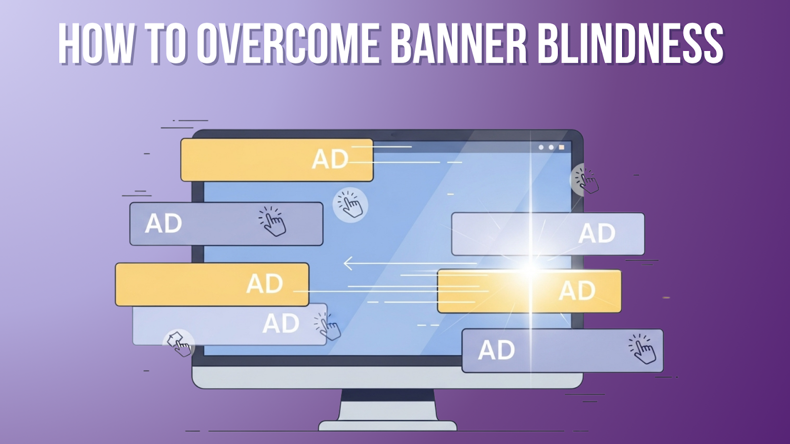
Source: The Ad Compare
To reduce banner blindness, your ads must align with how people naturally read, scan, and think. When your design of banner ads works with the brain instead of competing against it, attention becomes effortless.
Below are practical, research-backed strategies to make your banners stand out.
1. Choose Spots Where Eyes Naturally Go
Source: Rocketium
Most people don’t read web pages word by word. Their eyes move in quick patterns. One common pattern is the F-shape, where the eyes scan from left to right across the top, then move down the page and scan again across the text. Your ad becomes a part of the reader’s normal eye movement.
When you place your message:
- Near the top-left area.
- Close to the first few sentences.
- Along the natural reading path.
Why this works:
The brain pays more attention to areas it visits often. If your ad sits in a spot the eyes naturally cover, users notice it even if they didn’t plan to. You don’t force attention; you guide it.
Real example:
On news sites, ads placed between paragraphs get more views than ads placed on the far right sidebar. Readers are already moving their eyes down the text, so the ad becomes part of the flow.
2. Use Color and Contrast Wisely
Color plays a huge role in what people notice first. The brain always looks for differences in shade, brightness, and tone. Good contrast helps your ad stand out without looking loud or pushy. Don’t use too many bright colors. It can feel harsh and make people skip your ad. One or two strong colors are enough to create the right amount of attention.
For example:
- If the page has a white background, a grey or deep blue ad pops up.
- If the page is dark, a lightbox draws attention.
- Using a single bright accent color can highlight the main message.
3. Make Content Feel Useful and Personalize
People ignore ads that feel salesy or unrelated. But they notice content that feels helpful or matches what they are already reading.
To make your ad feel useful:
- Include tips or short advice.
- Add a question that connects with the reader’s problem.
- Use simple text that speaks to what the reader wants.
- Make the message match the topic of the page.
Why this works:
The brain always focuses on information that feels relevant. When the content inside your ad gives value instead of just asking for clicks, readers treat it like part of the content instead of an ad.
4. Keep It Clean and Simple
A cluttered design scares the brain. When people see too many shapes, too much text, or too many colors, their mind shuts down and ignores the whole thing.
A clean layout includes:
- Short sentences
- A clear main message.
- Only the most important visuals.
- Plenty of empty space (white space).
- A simple button or direction.
Source: Rocketium
Why this works:
The brain likes order. A simple ad feels safe and easy to understand in a second or two. Users spend only a moment deciding what to look at. If the message is clear, they engage faster.
Example:
“Save more time this week” with a simple icon and one button is more effective than paragraphs of text.
5. Try Different Sizes and Formats
People get used to seeing the same ad shapes over and over. Common sizes like 728×90 or 300×250 become invisible because users expect them. Can break the pattern and attract fresh attention.
Trying new formats, such as:
- Tall vertical ads
- Square cards
- Inline ads inside content.
- Sticky ads that stay in one spot.
- Interactive designs
Why this works:
The brain notices what looks different or unusual. When you switch sizes, you interrupt the “autopilot” that users go into while browsing. This small change can make an old message look new again.
Example:
A vertical ad placed beside a paragraph often gets more views than a horizontal banner at the top because it breaks the typical layout pattern.
6. Minimize Banner Noise for Internet Users
The higher the number of ads on the page, the higher the chances of being ignored. To avoid the problem of having too many advertisements in a single location, reduce the noise of banners to internet users by being very choosy about where to put your advertisements.
Rather than using programmatic advertising that automatically places your ads, use a service that enables you to take a manual approach. Research each website to see how much ad density there is before entering the URL into the targeting system. Do not place your ads on websites that have too many ads on the page.
7. Use Prominent CTAs in Banner Ads
Ad impressions are only the tip of the iceberg. You must also make people click, and that is, you must have an appealing call to action (CTA). In order to make people act, the CTA must make it clear what it is offering and what the viewer must do to receive it.
When the CTA is just “Click Here,” it will not go a long way to make the viewer take any action. The CTA needs to be descriptive above all else and let the viewer know that you are giving them what they want. For instance, “Shop Now for Exclusive Deals,” “Unlock Your Savings,” and “Explore Our Collection” are all more effective at getting the viewer to take action
If you want more help making effective ads, Tangence offers professional digital ad design services, including banner ads and graphics that grab attention.
Conclusion
Banner ads will always play a crucial role in digital advertising, but their effectiveness depends on the choices you make. When you personalize your creative, simplify your visuals, adjust placements, and refine the design of banner ads, you transform how users interact with them.
In case you require further help in designing good advertisements, Tangence offers professional digital advertisement design services, including banner advertisements and attention-grabbing graphics.
Would you like your advertisements to be viewed and clicked more often? Contact Tangence today to enhance your ad design and overcome banner blindness!