blog
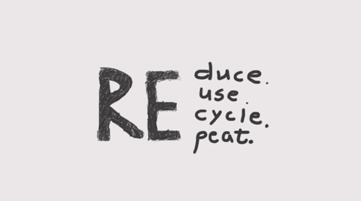
How an Infographic Design Company Ensures Brand Consistency
Brand consistency is one of those things you only notice when it’s missing. You’ve probably seen it yourself, a sleek website paired with visuals that feel off-brand, or an infographic that looks good but doesn’t quite sound like you. That disconnect chips away at trust faster than most people realize.
This is where a professional infographic design company earns its keep. Beyond making data look attractive, the right team focuses on aligning every color, font, icon, and layout with your brand’s voice and identity.
In this blog, we’ll break down how an infographic design company ensures brand consistency and why it matters more than ever for businesses trying to stand out in a crowded digital space.
Starting With A Clear Brand Foundation
Consistency begins before any sketch or chart. The team needs a strong base that everyone can follow. Most brands already have a style guide. If that guide is old or incomplete, the design team helps refine it. They check the logo rules and the color palette, and the font set. They also review the tone of voice so the words match the visuals. Next, they gather real examples from your website and ads, and slide decks. This shows what you use in practice, not only what the guide says.
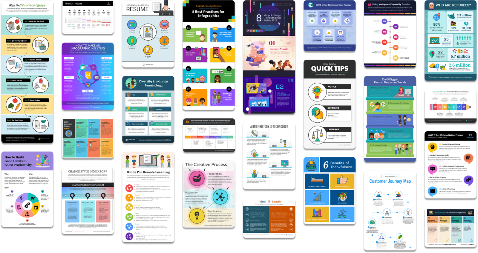
Image Source: Venngage
After that, they define the key brand signals. These are the small details people notice. For instance, it could be rounded icons and soft gradients. It could be sharp lines and bold blocks of color. Likewise, it could be playful illustrations or clean charts. Once these signals are clear, every later choice becomes easier. As a result, the design process moves faster with fewer revisions.
Building A Design System For Infographics
A design system is like a toolkit that makes repetitive work smooth. It includes reusable parts that still feel fresh when combined in new ways. The team creates layout templates for common formats.
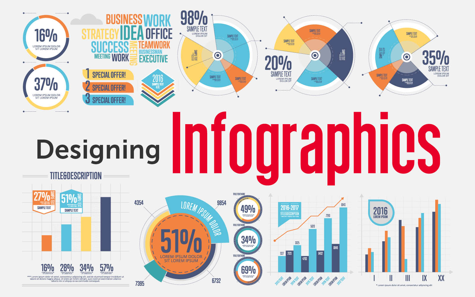
Image Source: TAD Graphics
For example, they may build a long scroll infographic and a square social version, and a slide-style layout. Each template follows the same grid rules. So spacing stays even, and the eye moves in a familiar way.
They also build a library of brand-ready elements. This includes icons and simple illustrations, and chart styles. It also includes headline styles and callout boxes, and section dividers.
Meanwhile, they test these elements in real content. Some colors look strong in a logo but may fail in small data labels. So the team adjusts contrast and hierarchy to keep readability high. Not only that, but they set clear rules for accessibility. That means text size and color contrast that work for more people.
Managing Color And Typography With Discipline
Color and type are the most visible brand cues. So they need strict control. The team starts by locking down the core palette. They define primary colors and secondary colors, and neutral tones. Then they assign roles.
- One color may be for key data points
- Another may be for highlights
- Another may be for background blocks
- This prevents random choices that dilute the brand
Typography needs the same care. The team chooses a clear type scale.
- Headlines use a one-size range
- Body text uses another
- Data labels and chart notes have their own rules
- They test the type at the final size for desktop and mobile
A reliable Infographic design company documents these choices in a working guide. It is short and practical.
- It includes real samples
- It explains what not to do
- It sets simple accessibility rules for text size and contrast
As a result, anyone who touches the file later can keep the same look.
Protecting The Logo And Key Brand Elements
Logos often suffer in infographics. People stretch them or place them on busy backgrounds. So the design team sets safe rules from the start. They use the correct logo file. They keep a clear space around it. They place it where it supports the story.
Usually, that means the header or the footer. They also avoid effects that change the logo style.
Beyond the logo, there are other brand elements. For instance, a brand may use a special pattern or a signature shape. It may use a specific photo style. It may use a set of mascots or characters.
The team adds these elements with purpose. They do not add them as decoration only. Instead, they use them to guide the reader through sections and to add emphasis.
Keeping Data Visuals On Brand
Data is the heart of many infographics. Yet charts can easily look generic. So the team sets chart rules that match your identity. They pick bar and line, and pie styles that fit the brand’s mood. They also define grid line weight and corner radius, and label placement.

Image Source: Visme
They also standardize how numbers are shown. For example, they choose one format for percentages and one for currency. They decide when to round numbers and when to show full precision. Likewise, they keep chart titles and sources in a consistent spot. This creates a rhythm across pieces. As a result, your audience learns how to read your visuals faster.
A skilled Infographic design company also checks for data integrity. They make sure scales are honest, and labels are clear. They confirm that charts match the message. So the infographic stays trustworthy while staying on brand.
Conclusion
Brand consistency is not a nice extra. It is a core part of trust. Infographics can amplify your brand fast because they travel across channels and are easy to share. That is why the design approach must be disciplined.
It starts with a strong brand foundation. It continues with a design system that controls layouts and charts, and text styles. It protects logos and key elements. It also aligns the voice and the story so the message sounds like you.
Finally, it uses clear review steps and multi-channel planning, so the final work stays consistent wherever it appears. When these steps are followed, your infographics look like they belong to the same family. As a result, your audience recognizes you faster and remembers you longer.