blog
10 Most Important Graphic Design Elements & How to Use Them
Graphic design is all around you. It’s in your books, on your favorite apps, in games, posters, ads, and even your cereal box.
Every good design uses a mix of important elements that make things look nice, clear, and fun to read or watch. Strong visuals aren’t just pleasing to the eye; they guide attention, shape emotions, and define brand identity. These elements help people understand the message and enjoy what they see.
By learning the top 10 most important design elements, you can make cool posters, art projects, or social media posts. Great design is not just for professionals—it’s for everyone, including you.
These tools can bring your ideas to life.
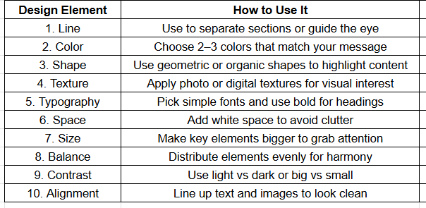
1. Line
One of the most prominent elements of graphic design is line. It is a path between two points. You can use lines to guide the eyes, separate parts of your design, or create cool shapes.
- Thick lines feel strong.
- Thin lines look soft.
- Straight lines look clean.
- Curved lines feel fun.
Lines help organize your work. They show where to look first. You can mix different lines to make patterns, shapes, or borders.
In logos, lines give balance.
In posters, lines make titles stand out.
Every graphic design agency uses lines to make things look neat and easy to follow. Try different styles of lines to see what works best.
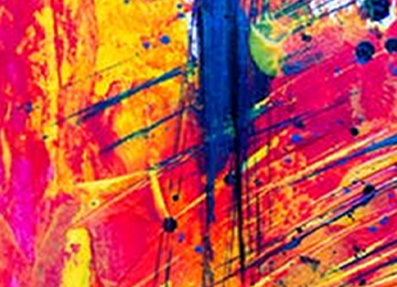
2. Color
According to a study by Colorcom, 85% of shoppers say color is a major reason they buy a product. So, color really matters!
Ever wonder what the main role of the colors in graphic design is?
Let me tell you that color brings emotion, mood, and meaning to your designs. They can make people feel happy, sad, excited, or calm.
Designers use colors to connect with the viewer’s heart.
So when you use it, it feels bold and full of energy.
- Blue feels calm and smart.
- Yellow brings joy.
Further, you can use a color wheel to pick good color matches.
But make sure to use a color that makes the design meaningful. Using too many colors can be confusing. Stick with 2 or 3 main colors for a clean design.
Also, remember that color looks different on screens and in print.
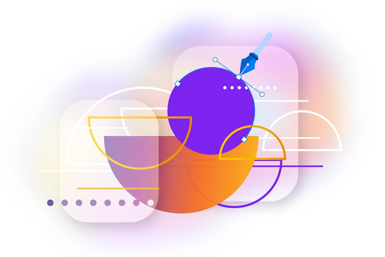
3. Shape
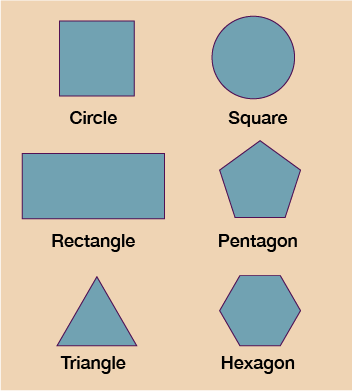
The other most important element you can use while graphic designing is shapes. Shapes are forms made when lines connect.
Shapes are of three types:
- Geometric (like circles and squares),
- Organic (like leaves or blobs), and
- Abstract (like logos or symbols).
Wondering where to use shapes?
Shapes can highlight a message or create fun patterns. They also help build logos, icons, and layouts. Use simple shapes to avoid clutter.
You can use shapes in smart ways:
- Use circles for friendly or soft designs.
- Use rectangles and squares for neat, clean looks.
- Use triangles to add motion or direction.
- Use abstract shapes to look modern or creative.
- Combine shapes for logos, frames, or backgrounds.
Shapes are everywhere. Start noticing them in your books, packages, or favorite games.
4. Texture
If you watch movies a lot, you might have seen that the display and graphics look real.
Ever wondered what that is? It is the texture. It makes things look real by adding smooth, rough, soft, and hard elements. Texture can be seen or felt.
In design, texture adds depth.
Flat images look better when texture is added. You can use photo textures like wood, metal, or fabric.
Digital textures can be dots, waves, or brush strokes.
A paper ad can have real texture. A screen image uses fake texture to look real.
Among different graphic design types, such as web design, and print design, texture plays a key role in making things feel more alive and natural. It makes people want to touch it—even if they can’t! Use texture carefully. Too much can be distracting. A little goes a long way.
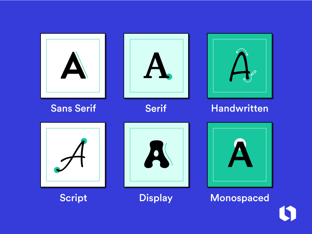
5. Typography
Here comes another and most important element of graphic design, Typography. It is the art of using fonts.
Fonts are the style of letters and numbers. They help people read your words and feel your message.
Good typography makes your work look smart and clear. It tells people if your design is fun, serious, cool, or fancy. You must choose the right font for the job.
Typography tips:
- Use bold fonts for titles or headings.
- Use simple fonts for long texts.
- Don’t mix more than two or three fonts.
- Leave enough space between lines and letters.
- Keep size big enough to read easily.
According to MIT, the right typography can improve reading speed by 20%. Choose wisely!
6. Space
If you are writing an article or making a design you have to make space between the headings and the content to make it look appealing to the audience. Space is the empty area between objects. It gives your design room to breathe. Without space, things look too crowded.
White space, also called negative space, helps your design look clean and neat. Designers use space to group things, highlight parts, and improve focus. More space around a heading makes it stand out. Less space helps connect items together.
When you look at a messy room, you feel stressed. The same goes for design! Use space to calm the viewer. Think about where things sit and how far apart they are. Good space makes your work shine.
7. Size (Scale)
Size means how big or small things are. Scale helps show what’s most important. Big things grab attention. Small things support the message.
You can use size to make titles pop. You can shrink small details so they don’t take too much space. Size also helps show levels in your design—what’s first, second, or third?
Try this:
- Make your main message the biggest.
- Then, use medium size for extra info.
- Small size is for things like footnotes or logos.
- Big things get noticed first.
- So use size to lead the eyes in the right order.
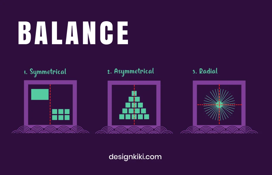
8. Balance
Balance means your design feels steady, not lopsided. There are three types:
-
- Symmetrical (same on both sides)
- Asymmetrical (different but still balanced).
- Radial (elements radiate from a central point)
A study from Canva says balanced designs get 75% more likes on social media. Try it!
Balanced designs are easy to look at. They feel right. You can balance text with images, or shapes with space. Don’t put everything on one side. Spread things out.
Ways to keep balance:
- Use same-size items on both sides.
- Mix big and small items evenly.
- Use colors in balanced spots.
- Use lines to lead the eyes across.
- Place titles in the center or corners.
9. Contrast
Contrast means difference. It helps one thing stand out from another. Use contrast in color, size, shape, or text.
Black and white is a strong contrast. Big and small also create contrast. Thick and thin lines can do it too. Contrast makes people look at what matters first.
If your text and background are too similar, they’ll be hard to read. Try light text on a dark background or the other way around. Contrast is your secret tool for making things pop. Without it, your design will feel flat or boring.
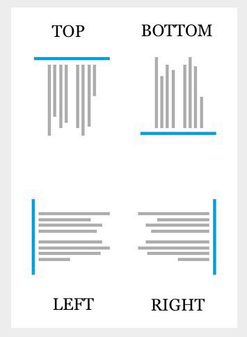
10. Alignment
Alignment means lining things up. It makes your work look clean and tidy. Think of how books are placed on a shelf—neat and in line.
When text, images, or shapes are aligned, people find it easier to read. Use grids or guides to help line things up. You can align things to the center, left, or right. Just don’t mix styles in one place.
Good alignment brings harmony. It makes your design look pro—even if it’s simple. Next time you place a title or image, check if it lines up. You’ll see the difference!
Conclusion
So, now you learn about the 10 basic principles in graphic design. These tools help you turn your creative new ideas into wonderful designs. A person does not have to be professional in order to do a good landscape design using these elements.
Graphic design is fun and powerful. According to Adobe, businesses that use good design earn 32% more trust from customers. So design is not just art; it is a superpower!
So take a blank paper and start scribbling with your crayons or computer. Think about colors, shapes, fonts, and lines. Think about space. Think about balance. Think about contrast. Think about alignment.
Keep designing, keep learning, and above all, make sure you are having fun!
Ready to Transform Your Visuals into Scroll-Stopping Designs?
At Tangence, our creative experts bring every design element to life—color, balance, contrast, and beyond—so your brand doesn’t just look good, it works harder.
Whether you’re revamping your brand or starting from scratch, let us craft visuals that drive results.
Let’s design something bold together. Get Started Today.