blog
Common Email Design Mistakes & How Agencies Avoid Them
Email remains one of the most trusted business communication channels. Professional teams rely on it to share updates, nurture leads, and build long-term customer relationships.
However, a strong strategy alone does not guarantee success. Design plays a critical role in how people read, understand, and respond to emails. When design feels confusing or heavy, readers lose interest quickly. This is where many businesses struggle without realizing it.
Research shows that people spend an average of only 8 to 10 seconds deciding whether an email feels worth reading based on visual clarity and structure. Email engagement data from Litmus also shows that well-structured and scannable emails can improve click-through rates by up to 30 percent compared to cluttered layouts.
An experienced email design agency understands that email design is not about decoration. It is about clarity, flow, and purpose. Every layout choice supports attention and action, and emails with clear hierarchy and mobile-friendly layouts consistently deliver higher engagement and lower bounce rates across devices. As a result, emails feel easier to read, more engaging, and more trustworthy.
This article explores some common email design mistakes that often limit results. More importantly, it explains how agencies avoid them through thoughtful design choices.
1. Overcrowded Layouts That Overwhelm Readers
Many emails fail because they try to say too much at once. Businesses often pack multiple messages, offers, and visuals into a single email. As a result, readers feel overwhelmed and unsure where to focus. When everything feels important, nothing feels clear.
Source: Fastercapital
An email design agency avoids this issue by designing with structure and restraint. Agencies treat white space as a helpful guide rather than wasted space. They create breathing room around text and visuals so readers can move comfortably from top to bottom.
How Agencies Keep Layouts Clean
- One clear goal per email that guides all design choices
- Clear spacing between sections to support easy scanning
- Short paragraphs that flow naturally without crowding
Because of this approach, emails feel calm, focused, and respectful of the reader’s time.
2. Weak Visual Hierarchy That Confuses Attention
Visual hierarchy helps readers understand what matters most. When all text looks the same, readers struggle to decide where to start. Many emails fail because headlines, body text, and calls to action blend.
An email design agency solves this by designing clear visual pathways. Agencies use size spacing, and alignment to guide the eye smoothly. The most important message appears first, and supporting details follow naturally.
How Agencies Create Strong Visual Flow
- Clear headline size that signals the main message
- Consistent spacing that separates ideas clearly
- Buttons that stand out without overpowering content
This structure helps readers understand the message quickly and confidently.
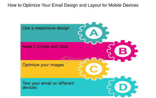
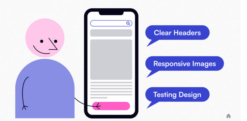
3. Poor Mobile Design That Breaks the Experience
Most people read emails on mobile devices during busy moments. Emails that look fine on a desktop often break on smaller screens. Text becomes tiny, buttons feel hard to tap, and layouts lose balance.
Source: beehiiv
An email design agency always designs with mobile-first thinking. Agencies test layouts across screen sizes to ensure consistency and comfort. They understand that mobile readability directly impacts engagement and response.
How Agencies Design for Mobile Comfort
- Large, readable text that works without zooming
- Buttons sized for easy tapping
- Single-column layouts that scroll naturally
This attention ensures emails feel smooth and usable on any device.
4. Inconsistent Branding That Reduces Trust
Emails that look different from other brand materials confuse readers. Inconsistent colors, fonts, or tone weaken brand recognition and trust. Over time, this inconsistency reduces confidence even when the content feels helpful.
An email design agency protects brand identity carefully. Agencies treat email as an extension of the brand experience. They align colors, typography, and tone with broader brand guidelines.
How Agencies Maintain Brand Consistency
- Use of approved brand colors and fonts
- Matching email tone with website and marketing content
- Templates that reinforce brand familiarity
This consistency builds recognition and long-term trust with every send.
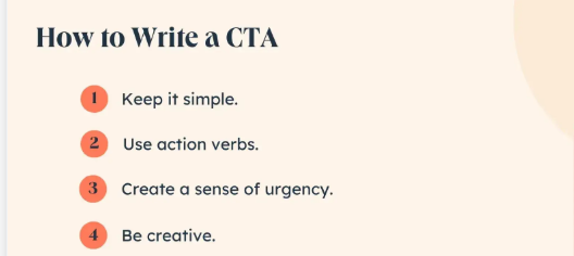
5. Unclear Calls to Action That Stall Engagement
Emails often fail when readers do not know what to do next. Weak calls to action feel vague or blend into surrounding content. When action feels unclear, readers postpone and forget.
Source : Hubspot
An email design agency treats calls to action as guidance rather than pressure. Agencies design buttons and links that feel naturally helpful and visible. They also ensure language feels simple and direct.
How Agencies Guide Clear Action
- One primary call to action per email
- Simple language that explains the next step clearly
- Button placement that follows content flow
This approach removes hesitation and supports confident engagement.
6. Heavy Images That Slow Loading and Distract
Large images can slow loading and break layouts across email clients. When images fail to load, messages lose meaning. Many businesses rely too heavily on visuals without considering technical limits.
An email design agency balances visuals with performance. Agencies use images to support meaning rather than replace text. They also optimize file sizes and ensure emails remain readable without images.
How Agencies Use Images Wisely
- Optimized image sizes for fast loading
- Text that communicates value even without images
- Visuals are placed only where they add clarity
This balance keeps emails reliable and accessible.
7. Ignoring Accessibility That Excludes Readers
Accessibility often gets overlooked in email design. Low contrast, small text or unclear structure make emails difficult for many readers. This creates barriers that hurt both experience and results.
An email design agency designs with inclusivity in mind. Agencies consider readability contrast and structure so more people can engage comfortably.
How Agencies Support Accessible Design
- High contrast text for easier reading
- Clear fonts that remain legible on screens
- Logical content order for screen readers
These choices show respect for every reader and strengthen overall communication
Conclusion
The mistakes discussed here are often made because email design seems simple at first glance. Yet thoughtful design requires understanding human behavior, attention, and trust.
An email design agency brings this understanding into every layout decision. Agencies balance clarity, creativity, and consistency while keeping the reader at the center. They design emails that feel easy to read, supportive, and purposeful.
For businesses, email remains a powerful connection tool. When design supports the message rather than distracting from it, emails build stronger relationships over time. The takeaway is simple. Clear, thoughtful design creates confidence. And confidence leads to meaningful engagement that lasts.