blog
How to Design Banner Ads People Recognize Instantly?
People scroll fast, and they skip a lot of content. So a banner ad has only a moment to say, “This is us.”
Instant recognition does not come from luck. It comes from clear choices that repeat across every ad and every screen.
If your brand looks different each time, people will forget you. That happens a lot in this highly competitive world. You must have a look and feel that stays in people’s memories. You should also deliver a message that feels familiar even when the offer changes.
That is where the design of banner ads becomes a real skill. It is not just about being pretty. It is about being seen and remembered.
For this reason, in 2023, global spending on display advertising was about $207.4 billion, which was the largest share of digital ad spend, and it’s projected to rise to roughly $266.6 billion by 2026.
This shows that display ads are really important. So here, you will learn simple steps to build banner ads that people spot right away and trust more because of that.
Know The Job Of The Banner
A banner ad has limited space and a short lifespan. So, it needs a single clear job. In many cases, the role of the design of banner ads is to make the viewer recognize the brand first. The click can come later.
Here’s another reason why you should want these kinds of designs: roughly 27% of consumers look up a business after viewing a display ad, and when they do, conversions jump by about 59%.
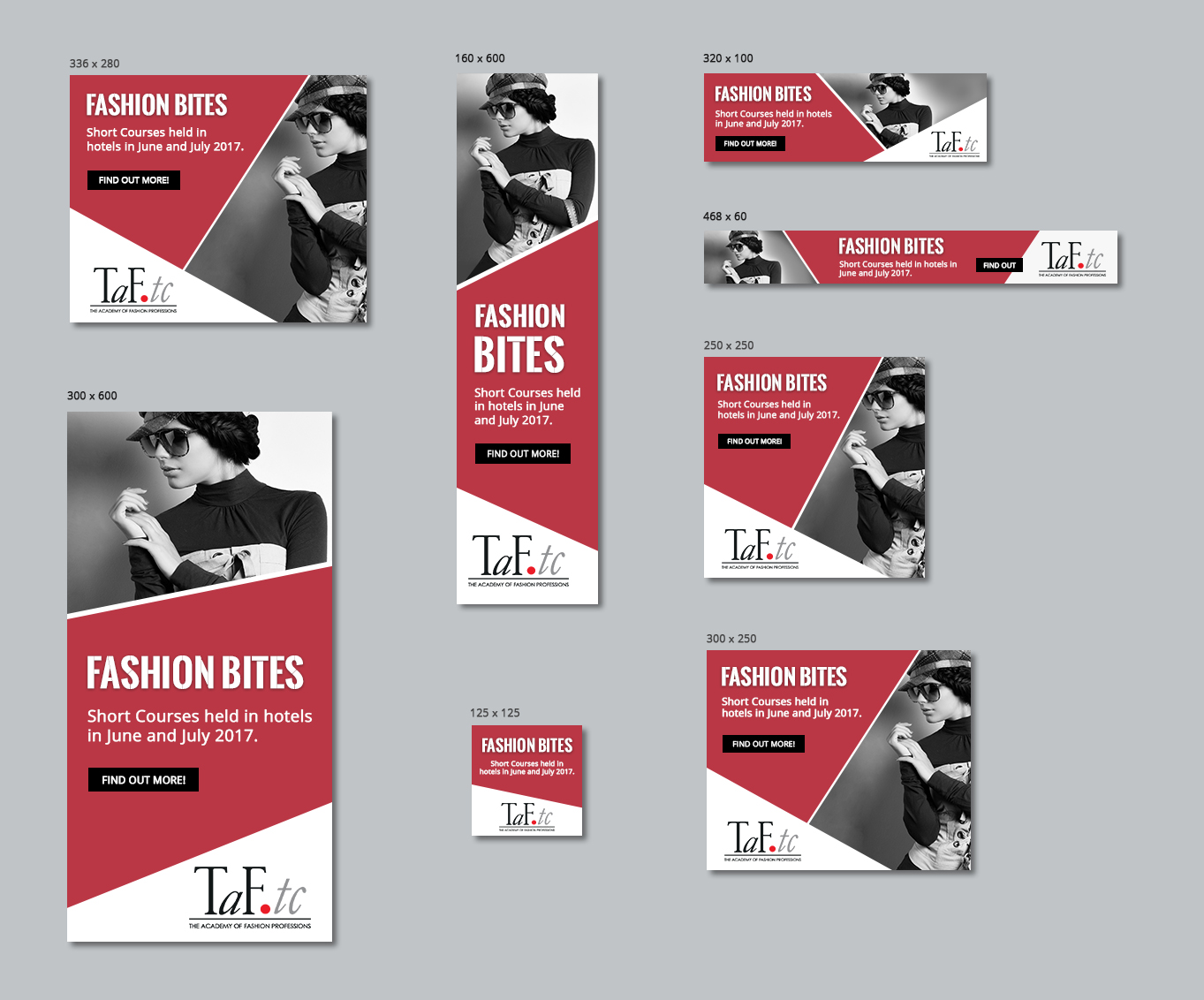
Image Source: Design Crowd
Start by deciding what the viewer should remember after one glance. It can be your logo, your product shape, or a short line that feels like your brand voice. Once you pick the goal, then every element should support it.
But here is the deal. A banner ad is not a brochure, as it is closer to a road sign. So remove extra words and extra images.
Keep one main idea, and if you have two offers, then choose one. If you have three messages, then keep the strongest one. As a result, the viewer can process it without effort. That easy feeling is what helps memory form in the customer.
Build A Clear Visual Signature
Recognition grows when the same signals show up again and again. Think of these signals as your visual signature. It can be a bold shape behind your headline, it can be a photo style that always looks the same, or it can be an icon set, a texture, or a simple pattern.
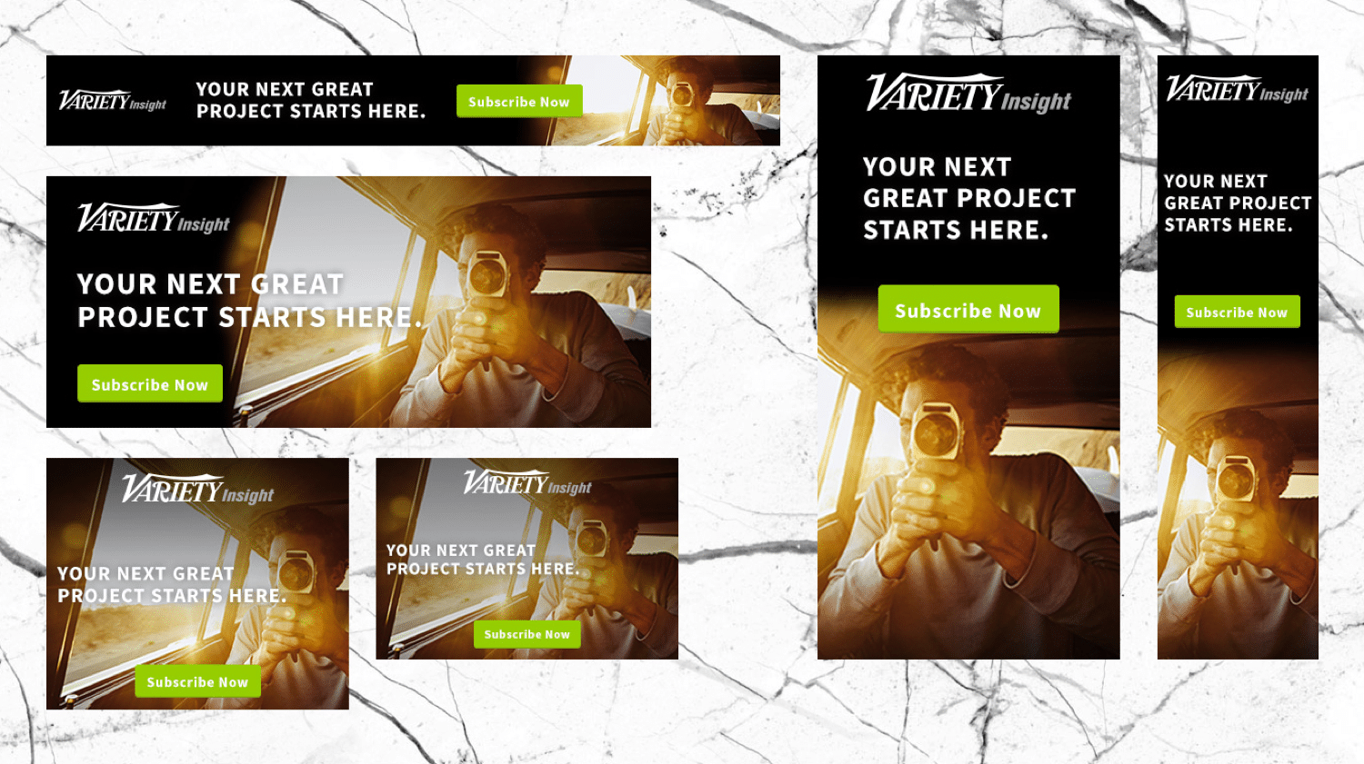
Image Source: Kinsta
Meanwhile, your logo should not do all the work. A logo is important, yet it is often small. So give the viewer other cues that feel like your brand.
For instance, you can use a consistent corner badge for offers. Or you can keep a fixed position for your logo and call to action.
Over time, people learn the pattern. They start to spot you before they read you. That is the point of strong branding. Plus, build a short checklist for the design of banner ads so your team repeats the same cues in every campaign.
Use Color And Contrast With Purpose
Color is one of the fastest ways to trigger recognition. However, it only works when you use it with discipline. Here is a simple way to keep color and contrast working for you.
- Choose one primary brand color for the main blocks.
- Choose one support color for highlights.
- Keep the rest neutral so the ad feels clean.
- Aim for a strong contrast so the text stays readable.
- If you use a photo, then add a soft overlay behind the text.
Also, watch out for color drift. Different designers may pick slightly different shades. That small change can break recognition over time. So store your exact color codes in a shared file.
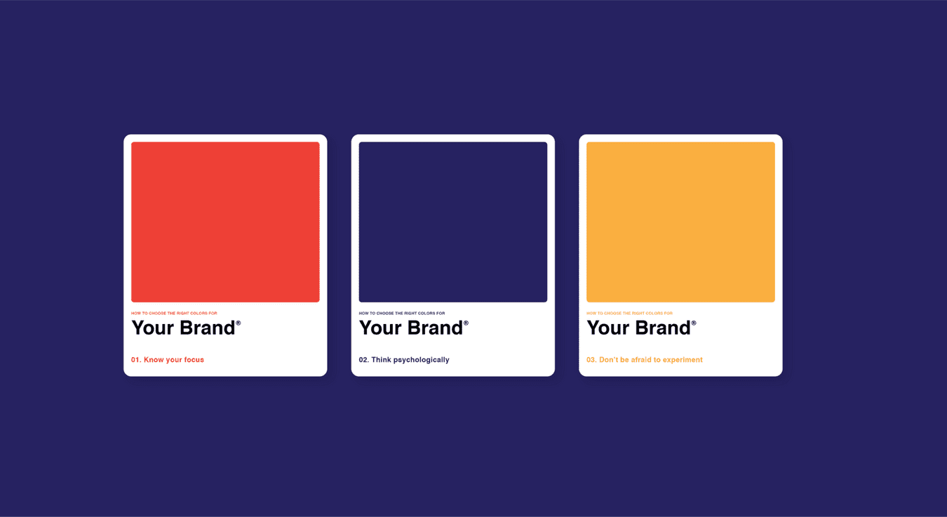
Image Source: Canva
Not only that, but test your banner on different screens. Some screens push colors warmer or cooler. Adjust if needed while staying true to the brand.
Choose a Type That Reads Fast
Fonts spread mood and speed. A banner needs a font that reads clearly.
So use a simple font with clean shapes. If your brand uses a special font, then keep it for headlines and use a standard font for smaller text. This keeps the style and improves clarity.
Limit the number of font styles. Two is often enough. Use one for the headline and one for the button. Then use size and weight to create structure. For example, a short headline in bold can lead to a small supporting line. Meanwhile, keep line length short. Long lines slow the eye.
Be careful with fancy effects. Outlines and shadows can hurt readability. So use them only when the background demands it.
Also, avoid all caps for long phrases. It can feel loud, and it can be harder to read. Instead, use all caps for a short label if it fits your brand.
Keep Layout Consistent Across Sizes
Banners come in many shapes. That can make branding messy. The solution is a layout system that adapts. Start with a simple grid and keep roles stable across sizes.
- Pick a fixed home for the logo.
- Give the headline a clear main zone.
- Reserve one spot for the call to action.
- Keep one dominant area and one support area.
- Design the smallest size first so it stays clear.
- Build templates for common sizes to protect consistency.
As a result, the viewer learns your structure. They can recognize you faster on the next impression. In addition, review the design of banner ads as a set, not as single pieces, so the full campaign feels like one family.
Conclusion
Instant recognition is built from repetition with purpose. Start by giving your banner one clear job. Then build a visual signature that shows up in every size and every campaign.
Use color with discipline and type with speed. Keep your layout consistent so people learn where to look. Add motion only when it guides the eye. Write copy that sounds like your brand and matches your landing page.
Finally, test recall so you know what people truly notice. When you do these steps, you earn familiarity. Familiarity becomes trust. Trust becomes action. The best part is that this is all learnable.
Once you treat the design of banner ads as a system, your ads will feel like the same brand every time. That is how you get banners people recognize instantly.