blog
Trends in eBook Cover Design Services Every Author Should Know
Your cover is the hello that meets a new reader. It works hard on small screens, in search grids, and in shared posts. It must signal genre, spark interest, and stay clear at a glance. Style matters, but so does function.
The best covers today feel fresh, but they also follow simple rules that help people see and choose with ease.
And so, I have written this article with the list below so that you can find the shifts that shape strong digital covers right now. Expect talk about type, color, clarity, and how a cover reads as a tiny square.
Take notes, try ideas, and test what you make. Small choices stack up into big wins and even ebook cover design services follow this principle. Your next cover can look good and sell well at the same time.
1. Thumbnail-first clarity
Most readers first meet your book as a small image. Nothing more than that, so putting some time into your image is really important. Many authors now lean on ebook cover design services to test what stays clear at tiny sizes. Aim for one focal point. Keep edges clean. Avoid clutter that turns to noise when the cover shrinks.
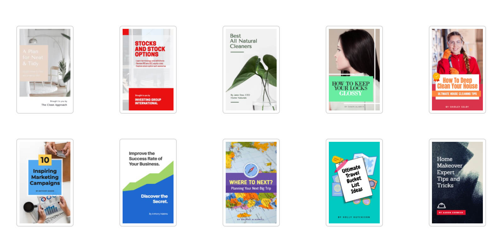
Image Source: Snappa
If you add fine texture or light detail, make sure it supports the main idea and does not steal focus. When in doubt, step back, squint, and ask a friend what they see first.
Quick checks
- Can a reader name the genre in two seconds
- Is the title legible without zoom
- Does the image resolve into a single shape at a small size
2. Bold, readable typography
Large, clear type is having a strong run. Tall sans serifs and sturdy serifs both work. The key is contrast and spacing. Avoid thin strokes and busy scripts for main words. Use decorative fonts only for a short accent. Track letters a touch wider for small-screen reading. Try title first, author second. Place type where it balances the art, not where it crowds it. Simple alignment rules beat dramatic tricks in most listings.
Try this
- Use one display font and one helper font
- Set the title in a weight that holds at small sizes
- Give the author name breathing room so it does not stick to the edges
3. Vivid color with smart contrast
Bright palettes are popular, but the reason they work is simple. They stand out on a phone. Pick two to three key colors and build from there. Use contrast that helps text pop. High contrast does not mean loud. A deep teal can set off warm coral. A soft cream can make a red word glow. Test on light mode and dark mode screens. Avoid color pairs that blur, like navy on black. Your aim is clear, not harsh.
Good habits
- Check contrast between text and background
- Keep gradients smooth and not muddy
- Use color to guide the eye from image to title to name
4. Illustration and symbolic storytelling
Photos still work, but many covers now favor art that hints at the story. Symbols, icons, and simple drawings invite the mind to fill in gaps. A key, a leaf, or a cracked mask can carry mood and genre.
Image Source: Webstacks
Illustration also helps you avoid the stock photo look. If you choose figures, try stylized forms or silhouettes so readers can project their own image. The rule stays the same. One idea per cover. Let the symbol do the heavy lift.
Where this shines
- Fantasy and myth with a single emblem
- Literary work that leans on mood
- Romance that uses florals or hand-drawn type
5. Clear genre signals and series systems
Covers that fit their genre sell better. Readers scan for cues. Color, type, and motifs act like a map. Once you set a style, build a system for future books. Keep the same type, layout, and spine plan.
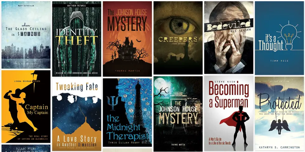
Image Source: All Time Design
Swap colors or symbols per title. Series branding helps readers spot your work fast in a grid. It also helps ads and social posts look neat and linked.
Build a simple system
- Fix a title size and placement
- Pick a base palette with three core hues
- Choose one repeat element, like a frame or badge
6. Screen-first composition
The usual rules that involve printing or display doesn’t always carry over to every screen. Imagine you’re using a phone, it’s obvious that some aspects of the eBook won’t be presented in its intended form.
But nowadays, covers are focused on other things that make it stand out. Like the fact that designers now take note and also make use of that white space. Center heavy items or anchor them to one side. Keep a clear edge so the image does not feel cut off in a square. If you add texture, use it to support the main shape, not to fill empty space.
Layout moves
- Use a strong diagonal or a centered emblem
- Align type to an invisible grid for balance
- Test in both square and portrait crops
7. Accessibility by design
Readable design is inclusive design. Good contrast helps everyone. Simple type helps everyone. Do not rely on color alone to signal meaning. If your title sits on a photo, add a soft panel or blur that area to increase contrast. Avoid tiny taglines. If you want a subtitle, keep it short and place it where the eye lands next. When your cover works for more people, it wins more scans and clicks.
Practical steps
- Check color contrast ratios for main text
- Keep minimum type sizes generous
- Avoid text on top of busy detail
8. Texture that holds up on small screens
Grain, paper, and brush strokes add depth. The trick is to keep them light. Heavy textures can turn to fuzz when scaled down. Use texture to frame the main shape or to add gentle shadow and light. If you love ornate detail, hide it in the close-up layer so it rewards a zoom view without hurting the thumbnail.
Use with care
- Subtle noise to reduce flatness
- Soft shadow to lift type off the background
- Light pattern behind a high-contrast title
Conclusion
Trends can change over the course of years or even just weeks but the best trends are the ones that have stood the test of time. Start with the tiny view, pick one clear idea, and make the type easy to read. Make sure that you use a color palette that will capture the reader’s attention. Your genre should stand out and be supported by the art. Build a simple system you can grow across a series.
Another important thing that you should remember is that when it comes to legal rights, there should be clear indications of who is doing what. Then test with real people on real phones which a lot of ebook cover design services do. You’ll learn fast what calls a click and what fades in a crowd. Keep it simple, keep it sharp, and let your next cover say come read me in the first blink.